Projects

Solutions built through collaboration

We work with companies across different industries, from healthcare and tourism to natural products, consulting and local businesses. Depending on the project needs, our work may include website development, interface design, content organization, branding, packaging or a complete digital presence.

Milmedika

// Rebranding// Website// App design
Visit website

A clearer digital experience for a healthcare system

// UI/UX design

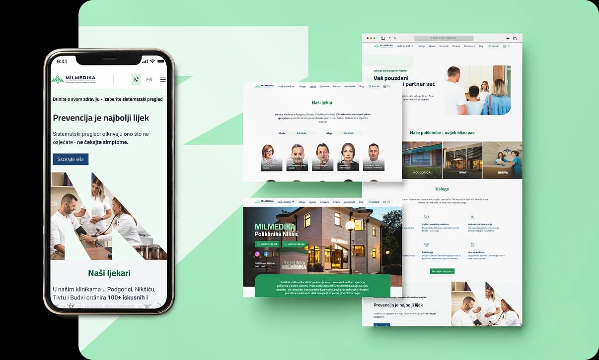
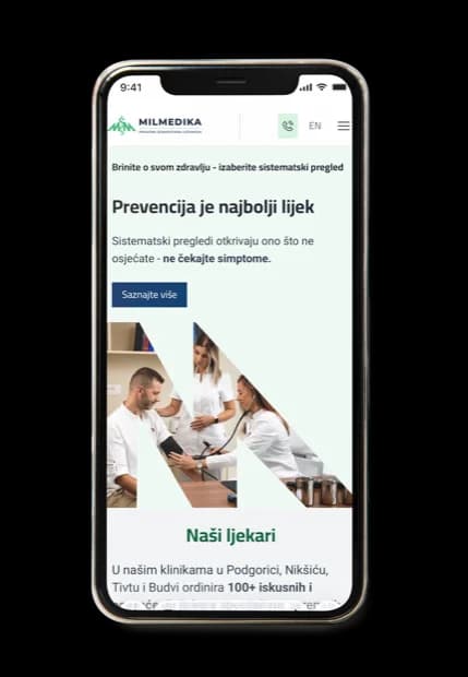
For Milmedika, we worked on the website redesign and content organization, focusing on helping users find services, doctors, clinics and useful information more easily. Special attention was given to a clear structure, an accessible presentation of a large amount of data and simple use across different devices.
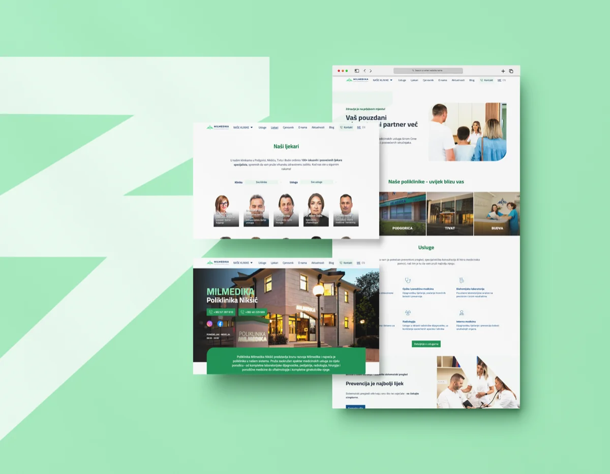
Milmedika — prikaz 1
Milmedika — prikaz 2

Rebranding and clearer visual communication

// Rebranding

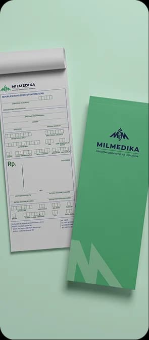
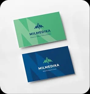
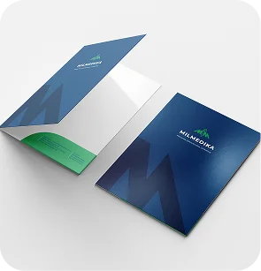
Alongside the digital solutions, we also worked on the documentation and graphic materials used in the institution's everyday work. The goal was for all materials to follow the same visual system and for communication to stay consistent, clear and easy to apply across different formats.
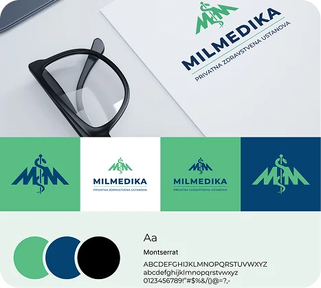
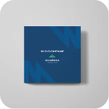
Milmedika — prikaz 1
Milmedika — prikaz 2
Milmedika — prikaz 3
Milmedika — prikaz 4
Milmedika — prikaz 5
Milmedika — prikaz 6

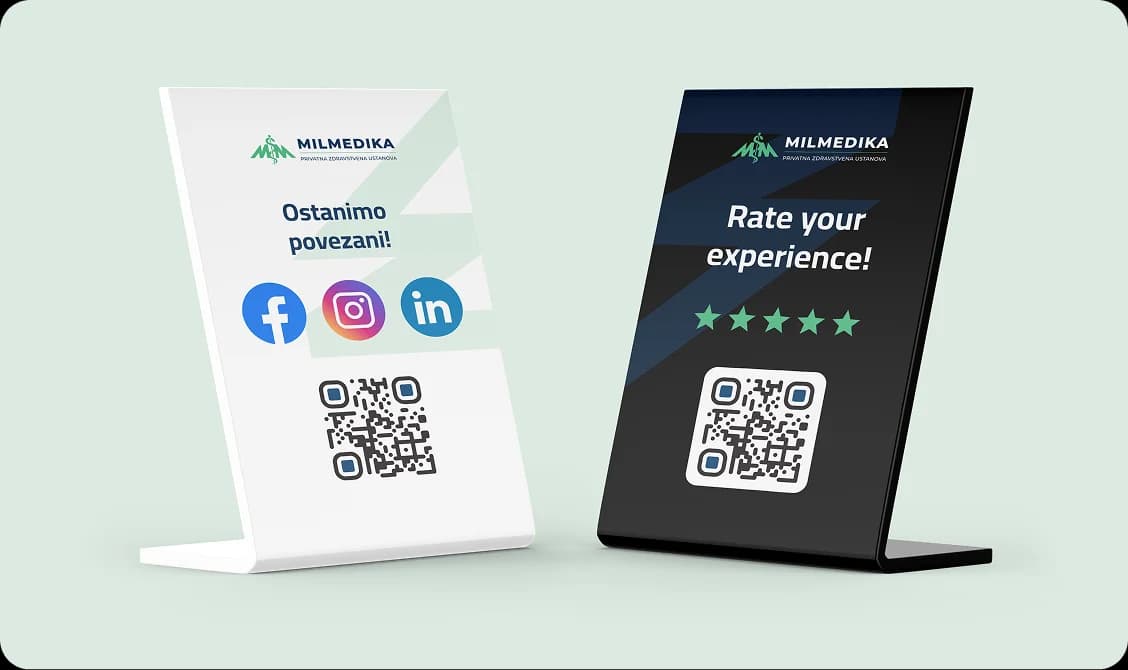
Branded stands for contact and reviews

// vizitkarta.me

For Milmedika, we also developed branded stands that make it easier for patients to access contact information and leave reviews. These materials connect the physical space with digital channels, making communication after a visit simpler.

Milmedika — prikaz
Visit website

Herbal Montenegro

// Branding// Website// Packaging
Visit website
Herbal Montenegro — prikaz

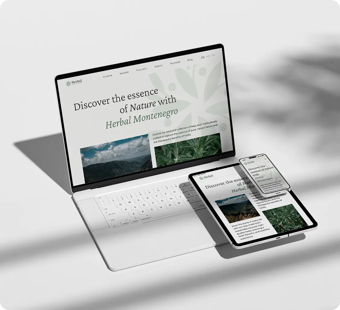
A website that presents the brand and its products

// website

The website was designed as a clear presentation of the Herbal Montenegro brand, its story and its products. The focus was on a simple structure, a legible presentation of information and a visual feel that follows the natural character of the products. Through the design and the organisation of content, visitors can more easily get to know the range, the ingredients, the origin and the values behind the brand.

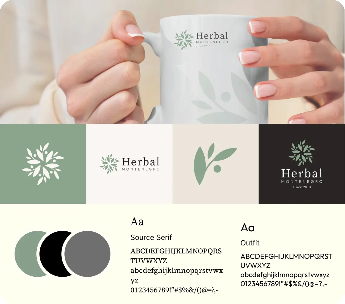
A natural character carried through visual identity

// branding

The branding focused on a clean, calm visual direction built on herbal motifs, natural tones and simple use across different formats. The identity was shaped to feel authentic and orderly, with enough flexibility to work on packaging, digital channels, promotional materials and the brand's everyday communication.

Herbal Montenegro — brend materijali
Herbal Montenegro — prikaz

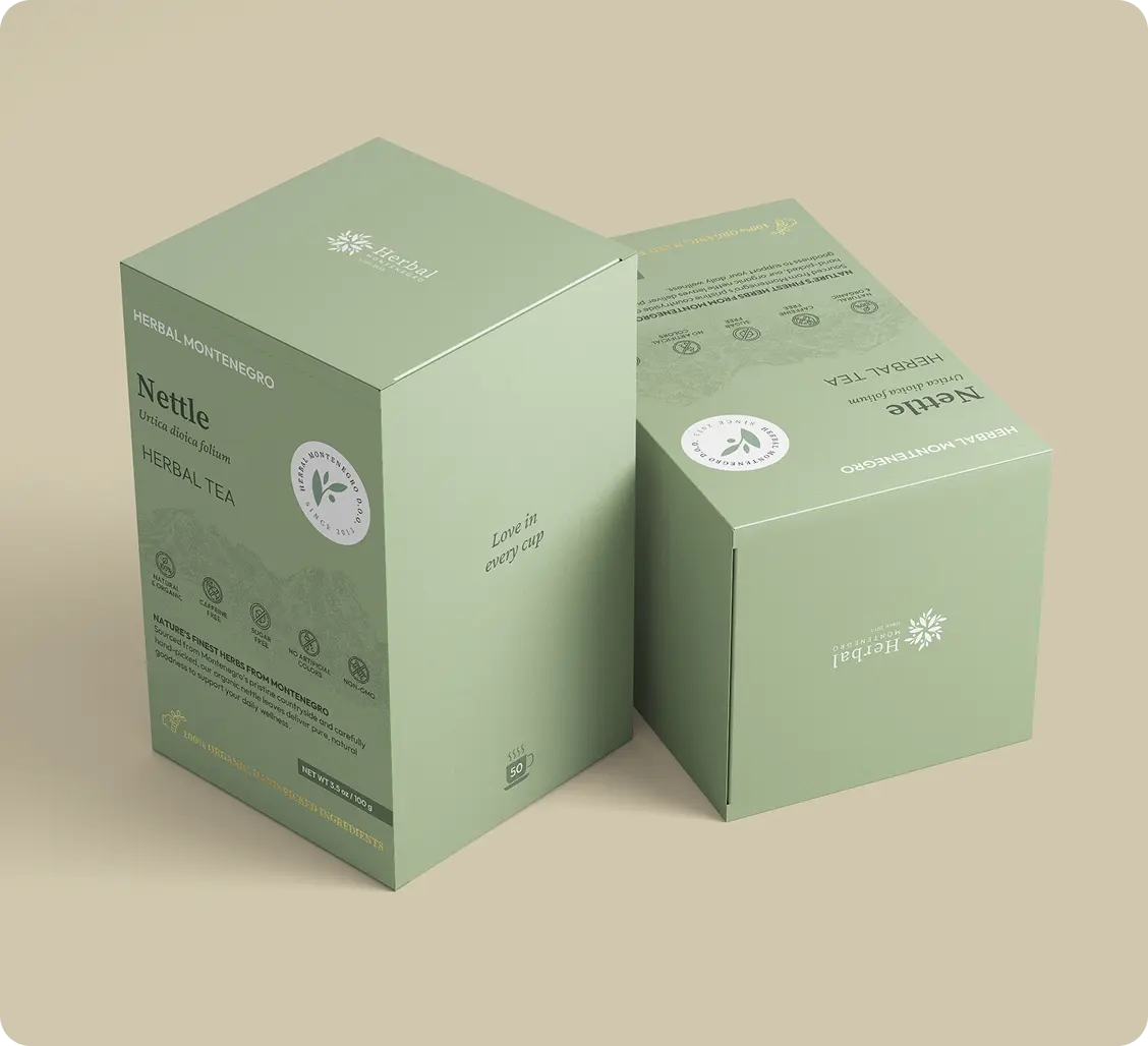
Packaging with a clear structure and a herbal character

// Package design

The packaging design focused on making the products clearly presented, easily recognizable and visually aligned with the brand's natural character. Each label was shaped to be clear, warm and informative, with enough space for the product name, ingredients, usage instructions and other important details.

Illustrations and herbal elements were carefully worked into the design so the packaging feels authentic and close to the products it represents. Rather than an overly decorative approach, details were used sparingly, supporting a clean design, making it easier to tell products apart, and giving the whole line a recognizable visual signature.

Visit website

Hotel Conte

// UX/UI design// development
Visit website
Hotel Conte — prikaz

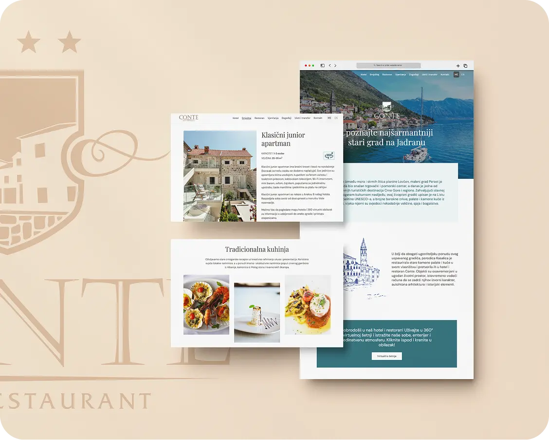
A digital experience for a hotel in the heart of Perast

// website

For Hotel Conte, we designed and developed a website that presents the accommodation, restaurant, events and authentic experience of staying in Perast in a clear and elegant way. The website brings together the hotel's complete offering through a visual and user-focused approach that reflects the atmosphere of the Bay of Kotor.

Mercatura

// UX/UI design// development// branding
Visit website

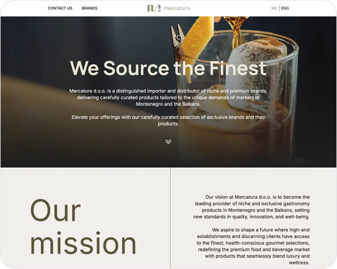
A clear presentation of premium brands and products

// website

For Mercatura, we built a website that presents the company, its offering and the brands it represents in a simple and clear way. The focus was on making it immediately clear what Mercatura does, who it's for and what kind of products it brings to the market.

Mercatura — prikaz
Mercatura — prikaz

Visual identity for a premium gastronomic offer

// branding

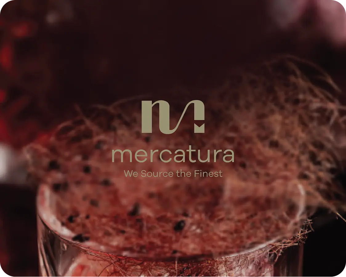
Mercatura is a brand bringing carefully selected premium products from the world of drinks, food, and gourmet offerings to Montenegro and the Balkans. Our task was to shape an identity and digital presence that follows that idea - elegant enough to communicate exclusivity, but clear enough for the brand to feel reliable, modern, and close to its target audience.

Visit website

Verdeeva

// UX/UI design// development// Branding// Webshop// Packaging design
Verdeeva — uvodni prikaz

A natural character carried through visual identity

// branding

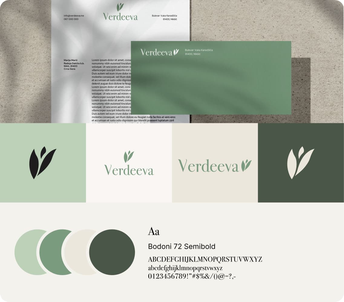
Verdeeva's visual identity was developed to convey a sense of natural origin, carefully chosen ingredients and simple everyday use. Through color, typography and graphic elements, a calm and recognizable visual direction was established that the brand can use across packaging, digital channels and promotional materials.

Verdeeva — brend materijali

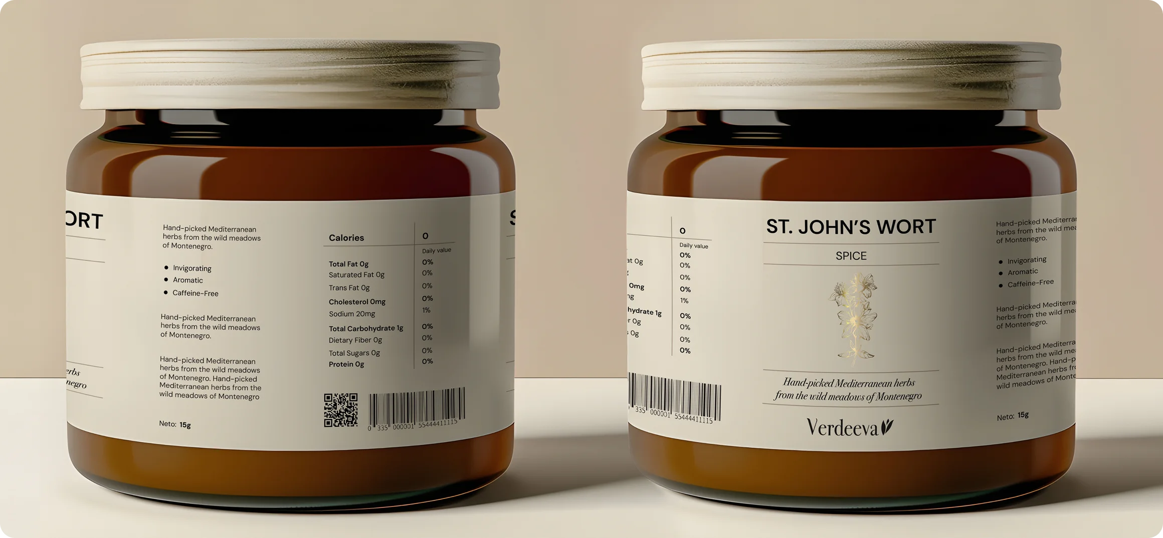
Packaging with a clear structure and a herbal character

// Package design

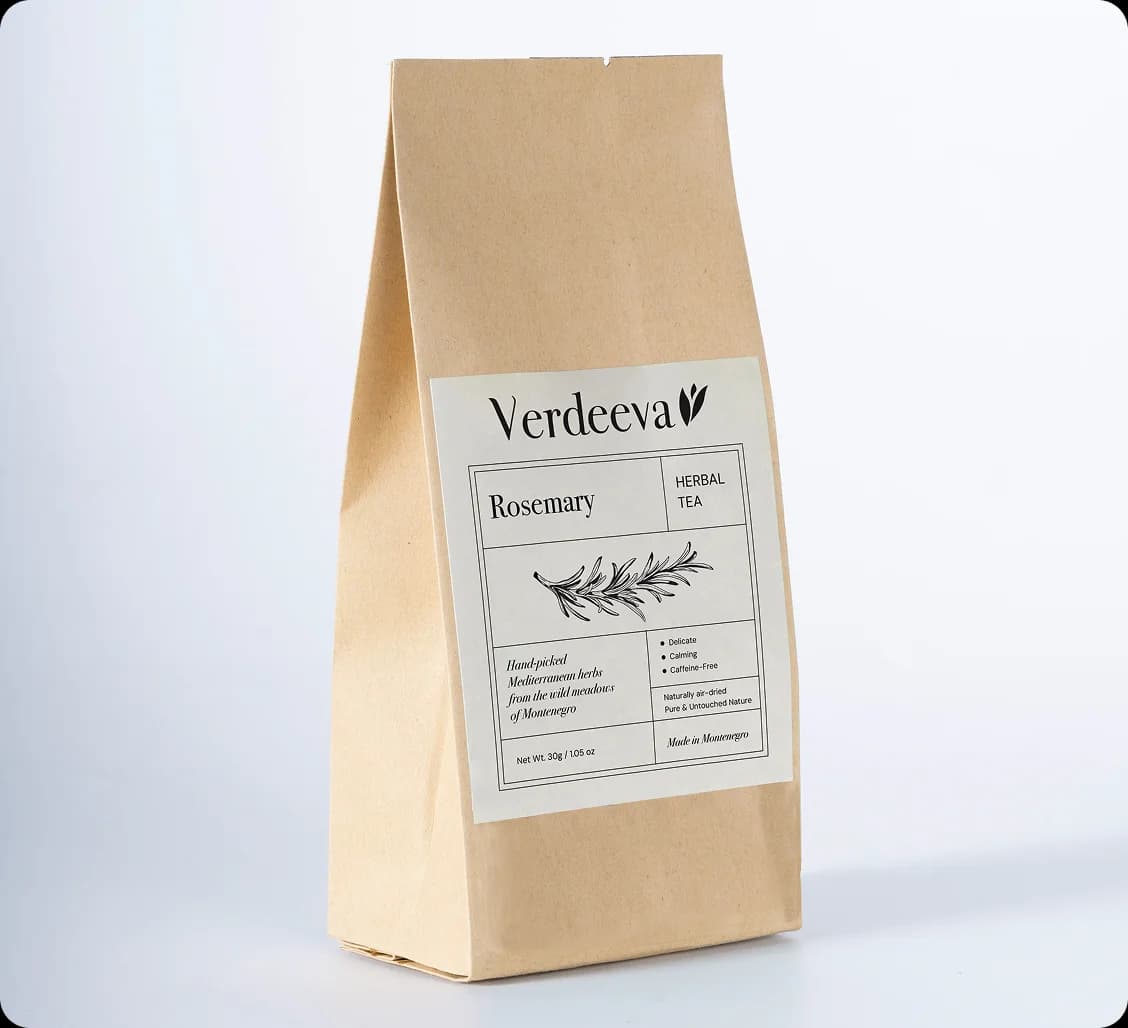
The packaging design focused on making the products clearly presented, easily recognizable and visually aligned with the brand's natural character. Each label was shaped to be clear, warm and informative, with enough space for the product name, ingredients, usage instructions and other important details.

Illustrations and herbal elements were carefully worked into the design so the packaging feels authentic and close to the products it represents. Rather than an overly decorative approach, details were used sparingly, supporting a clean design, making it easier to tell products apart, and giving the whole line a recognizable visual signature.

Verdeeva — prikaz

City Fitness

// UX/UI design// development
Visit website
City Fitness — prikaz

A website for a clearer presentation of classes and services

// website

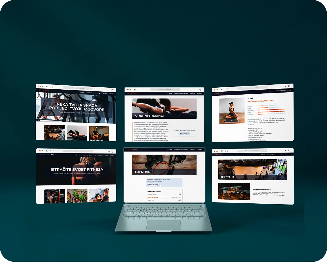
For City Fitness, we built a website focused on clearly presenting services, classes and useful information for members and new visitors. The goal was to bring together the different parts of the offering in one place — from the gym, group and personal training, to assessments, nutrition plans and additional content.

Pure Skin

// Branding// Packaging design// UX/UI design// development
Pure Skin — prikaz 1
Pure Skin — prikaz 2

A visual identity for a natural cosmetics brand

// branding

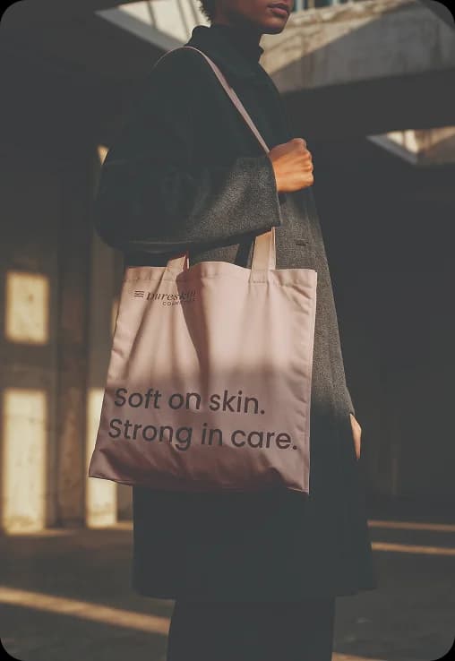
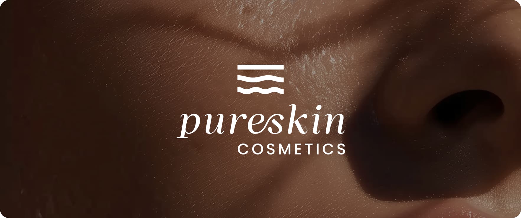
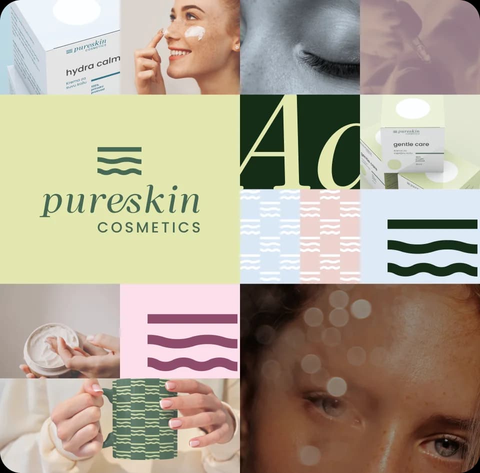
Pure Skin is a natural cosmetics brand we worked with on developing its visual identity and supporting materials, focusing on a clean, gentle and contemporary visual expression that also builds trust in its skincare products.

Pure Skin — brend kolaž

Developing the identity meant finding a balance between a natural and a professional expression. Through color, typography and graphic elements, a calm visual direction was shaped that conveys a sense of care, balance, simplicity and protection. Graphic elements inspired by layers of skin were carefully worked into a system that is subtle, recognizable and easy to apply across different formats.
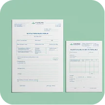
The identity was set up so it can be applied consistently across packaging, digital channels, presentations and any future brand materials.

Packaging and supporting materials

// Package design

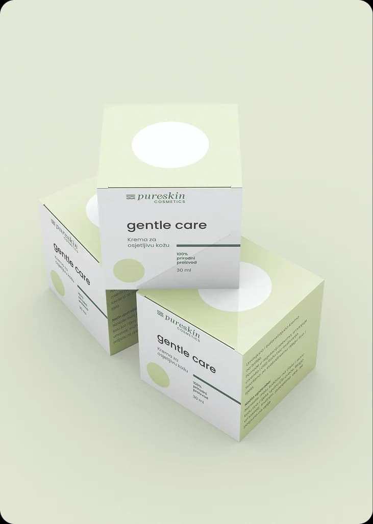
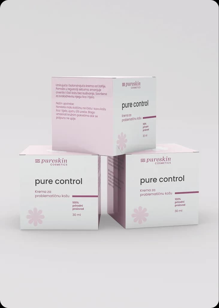
The packaging and supporting materials were designed to be clean, clear and simple to apply. Through soft colors, a clear layout and enough room for information, the products get a calm, well-cared-for look without unnecessary detail.

The goal was for the packaging to feel tidy, high-quality and close to the brand's character, while keeping all the important information easy to notice and understand.

Pure Skin — prikaz 1
Pure Skin — prikaz 2

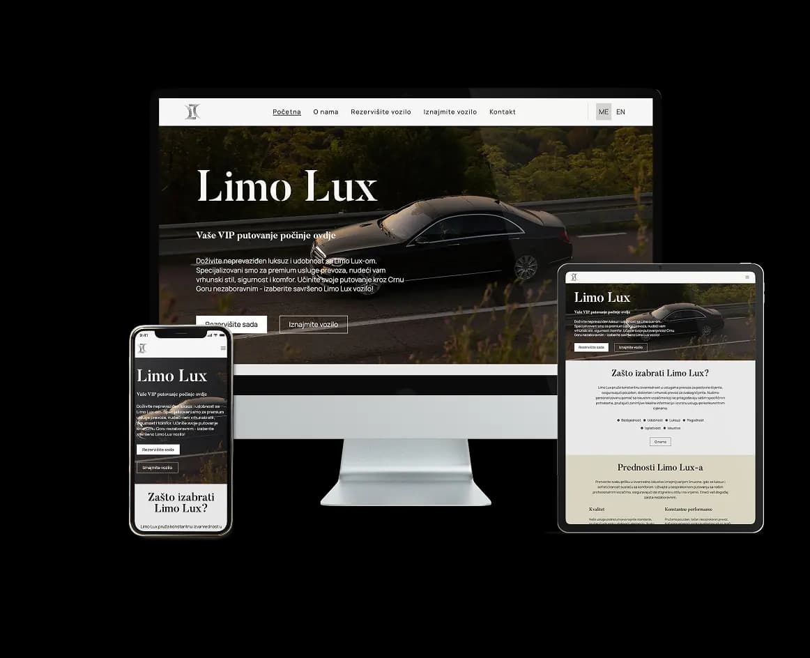
Limo Lux

// UX/UI design// development
Visit website
Limo Lux — prikaz

A website for premium transport and simple booking

// website

For Limo Lux, we worked on a website that presents the luxury transport service through an elegant and clear digital presence. The focus was on a premium visual impression, a clear presentation of services and a simple way for users to find information and book.

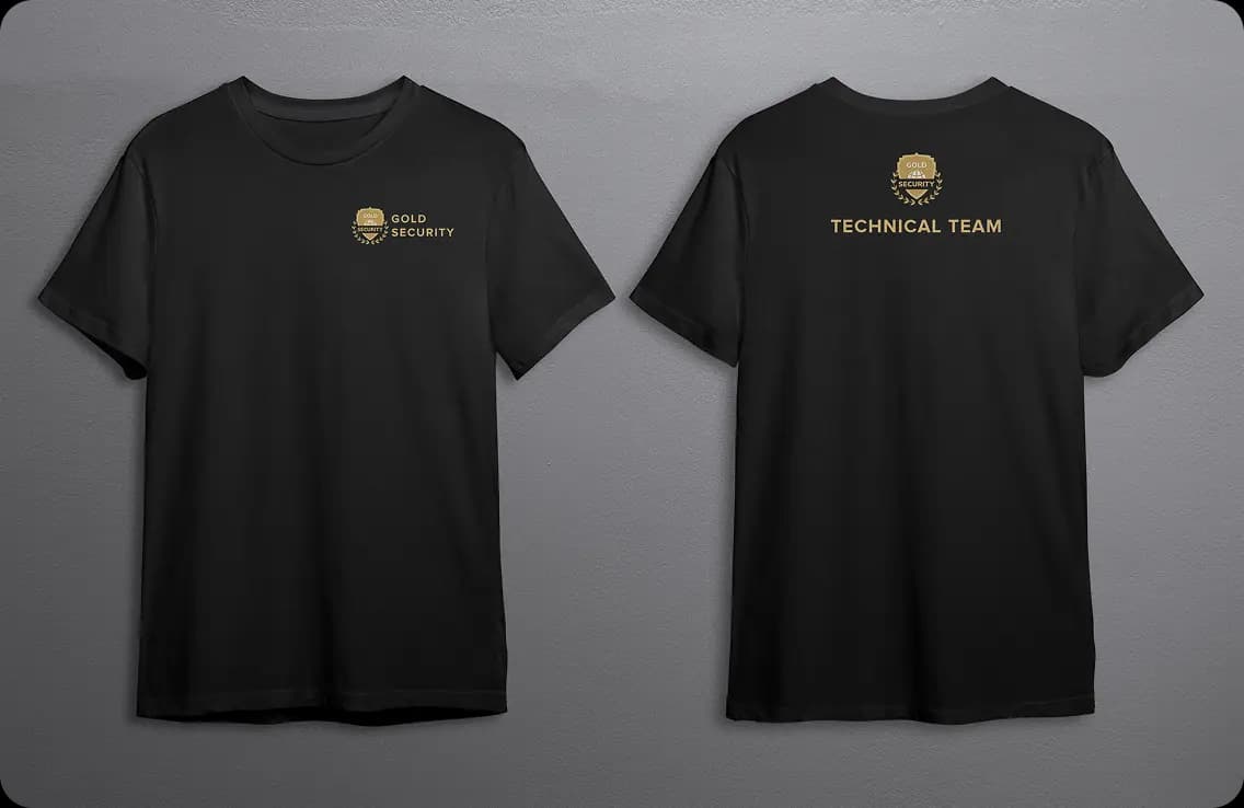
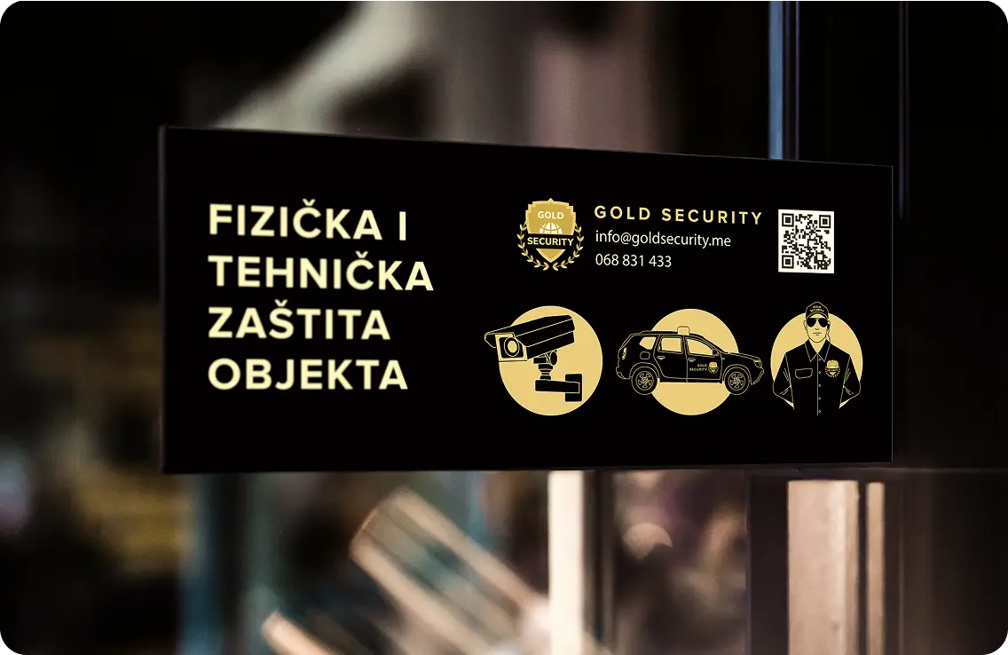
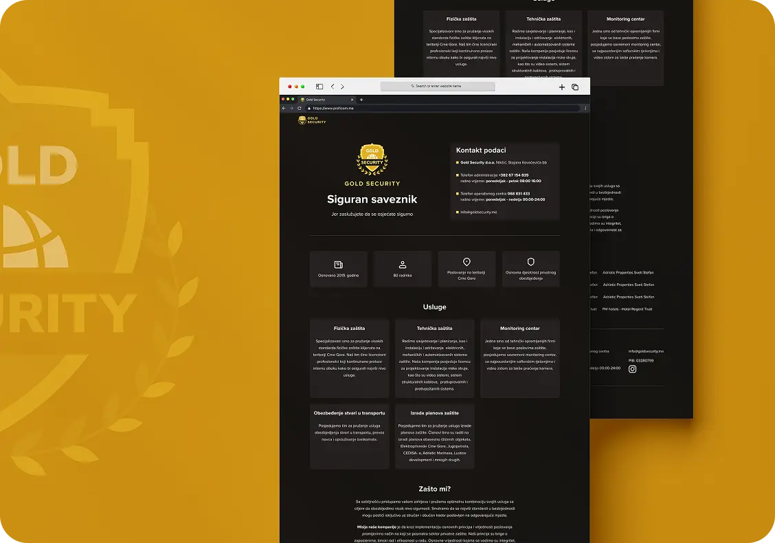
Gold Security

// UX/UI design// development// rebranding// vehicle// signage
Visit website
Gold Security — prikaz

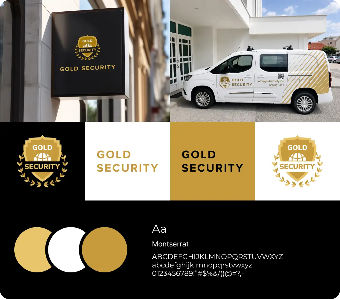
A rebrand for a clearer, more professional presence

// rebranding// vehicle// signage

For Gold Security we refreshed the visual identity and the way it is applied across different formats. The goal was for the brand to keep its serious, dependable character while gaining a more contemporary look and more consistent communication.

The identity was adapted to work equally well on digital channels and on uniforms, vehicles, exterior signage and promotional materials that matter for the company's day-to-day presence in the field. These elements help the brand stay recognizable, consistent and professional in the real world.

Gold Security — brend materijali
Gold Security — prikaz

Website with a clear company presentation

// website

The website was designed as a clear presentation of the company, its services and the way it works. The focus was on a simple structure, a legible overview of the services and quick access to key information, so that visitors can easily understand what the company offers and how to get in touch.

Visit website

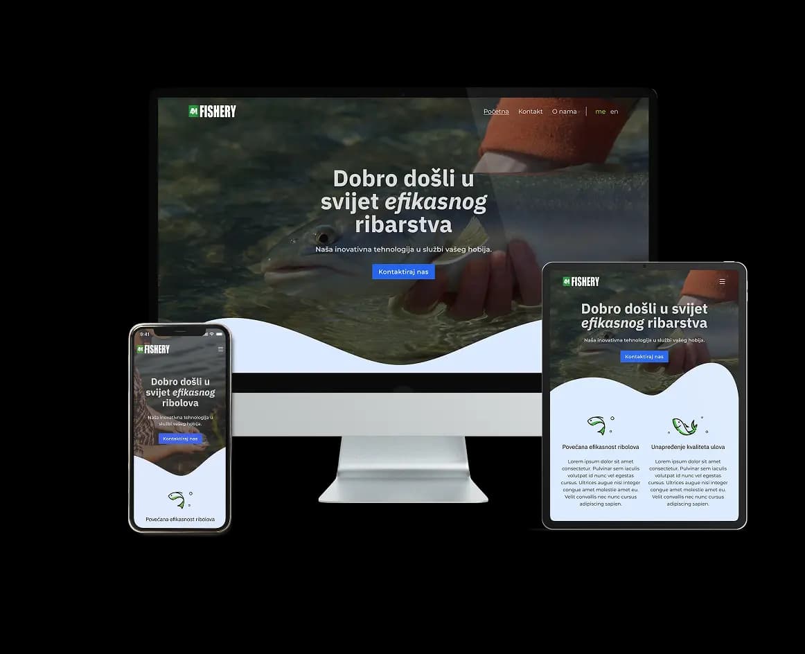
4M Fishery

// UX/UI design// development
Visit website
4M Fishery — prikaz

A website for presenting fishery technology

// website

For 4M Fishery, we built a website focused on clearly presenting the products and technology built for fishery and fish farming. The goal was to simply show what the brand does, what products it offers and how its solutions help users in their everyday work.

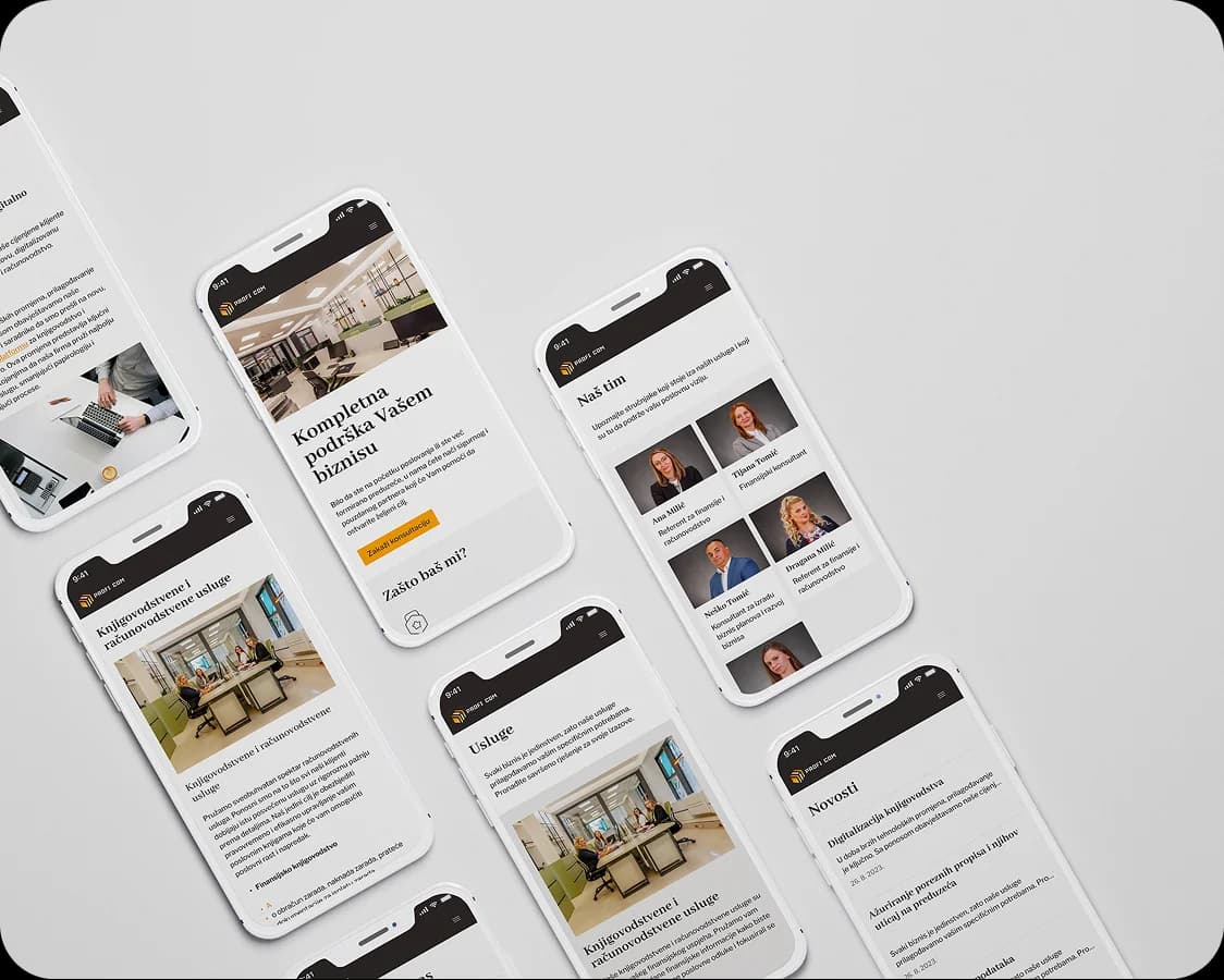
Profi Com

// UX/UI design// development
Visit website
Profi Com — prikaz

A clear website for complete business support

// website

For Profi com, we created a website that clearly presents the company, its services and business space, with a professional and clear visual approach. The goal was for users to quickly understand what the company offers, who it serves and how to get in touch.

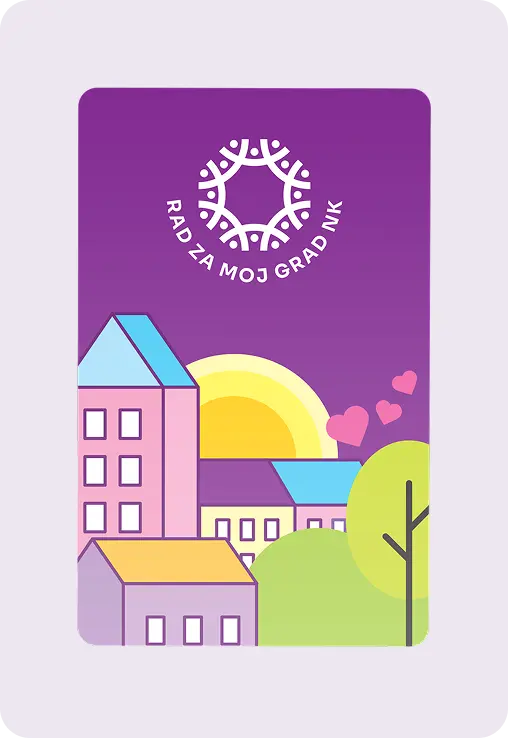
Rad za moj grad

// UX/UI design// development// branding
Visit website
Rad za moj grad — prikaz 1
Rad za moj grad — prikaz 2

Branding for a civic initiative

// branding

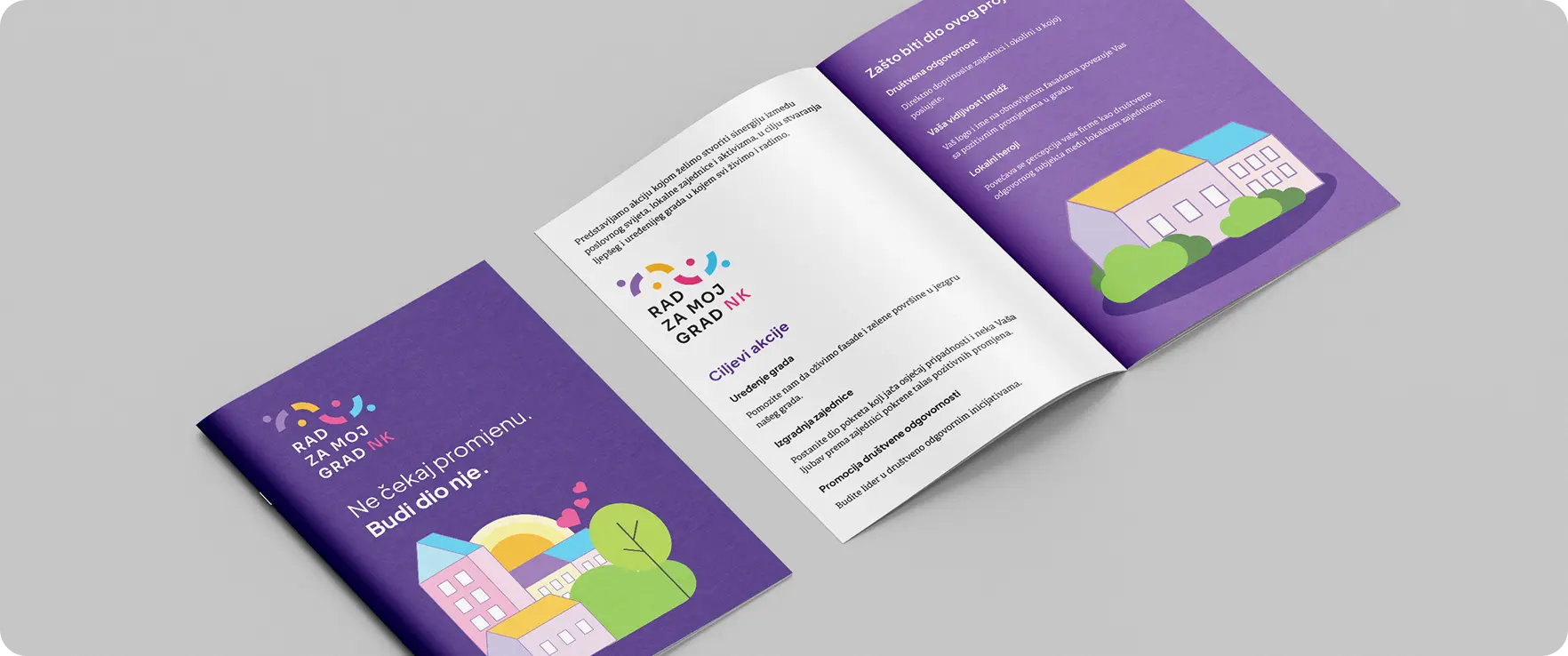
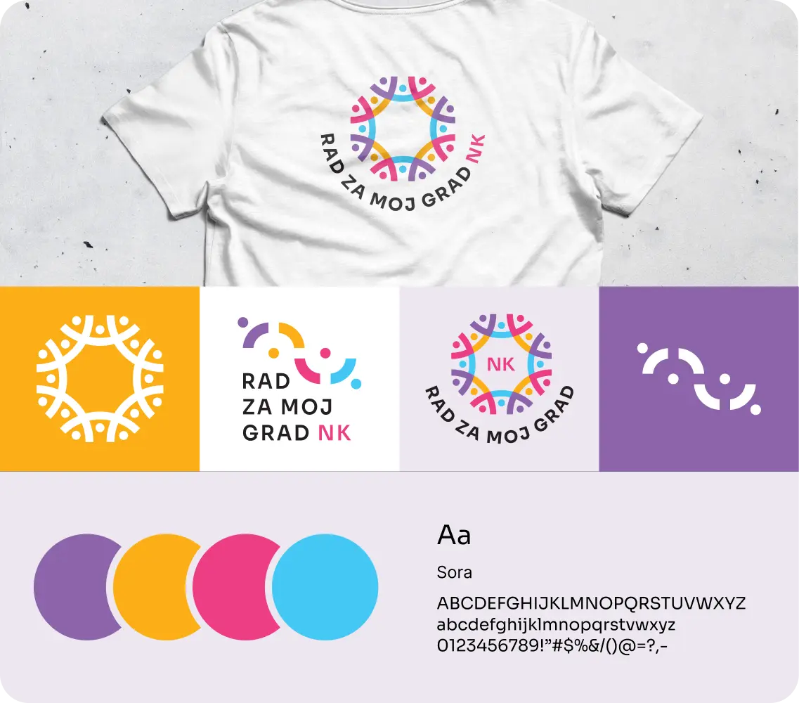
For Rad za moj grad, we created a visual identity that conveys the idea of togetherness, action, and positive change in the local community. Through a recognizable symbol, vibrant color palette, and simple typography, we created a system that can be applied across brochures, promotional materials, and digital communication.

Rad za moj grad — brend materijali
Rad za moj grad — prikaz

A website for a civic initiative and community involvement

// website

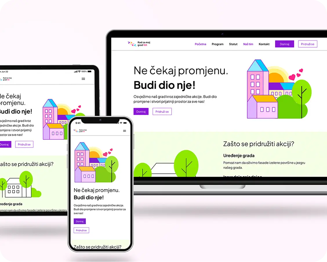
For Rad za moj grad, we built a website focused on clearly presenting the initiative, its goals and the ways citizens and businesses can get involved. The goal was for users to quickly understand what the project does, why it matters and how they can contribute — through volunteering, donations or supporting specific actions.

Visit website

Reach out

+382 69 873 900

office@increment.tech

Contact us

©Increment TECH 2026. All rights reserved.